Designer Tools
Tools are the typical controls you tend to find in any App regardless of its target marketplace. Use the arrow icons in the top bar to collapse the tool selection for more flexibility when working within the design canvas.
|
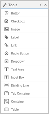
In the Tools box, you have:
|
General properties
Drag a control onto a page, and then configure it using the toolbar and the control's Properties panel. Properties always shows the settings for the selected item.
Although you can position and size with the mouse, the X, Y, Width and Height settings on the toolbar give you more control. X and Y denote the control's top left corner.
Everything on a page (tool or snippet) has Name and Element Type properties:
- A default Name is created for each item. However, you should implement a naming convention, particularly if you want to reference the object in scripting.
- Element Type shows you what type of tool or snippet something is.
See Tooltips for details on user assistance options, and Visibility for details on when you might want to hide controls (or snippets).
When logical, controls also have Tab Index and CSS Class properties. These control tab order, and optionally, the CSS style used at runtime to override the default styling. See Tab order and CSS in Apps for details.
Each control's scripting events can be seen in Page Navigator, or by opening Scripting with the control selected.