Container


Use Container objects to group controls. Snippets are often contained within Container objects.
Once you drop items onto a Container, they are tied to it. Move the Container and everything moves.
Use the  icon (top left corner) to select the Container itself.
You can use the toolbar's Background Color and Border Color to visually delimit
Container objects. Any border effect consumes pixels within the Container object's
Height and Width settings.
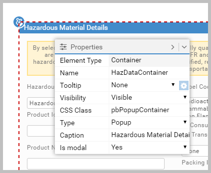
The Container object’s Type property can be set to Popup.
Such objects are common in Apps as they let you show and hide functionality as required. For example, in the Warehouse App, the Hazardous Data
snippet is held in a popup. For popups, if the Is modal property is set to Yes,
the user must interact with the popup before going back to use the parent App. You also get a Caption property to give the popup a title.
Popups have many uses. For example, you could have a popup Container object called HelpText tied
to a Button object. There are two ways to make the button display the popup:
Article last edited 12 January 2017