Images and icons
Images exist as controls in their own right, and icons can be associated with many controls. Typically, images
are used for branding, whereas icons are used to enhance the UX.
Images
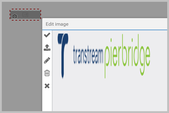
To add an image, drag an Image control onto the page, and
then click  . If
the image is there, select it, and then click
  . If not,
click
  to upload it. The maximum upload size is 480x480 pixels and 150 DPI. Uploaded images
become available for other Image controls.

To change an existing image, click  , and then select or upload a new image as described above. This is how you
change the branding on an App.
 lets you select part of the image to be used.
Note
You can also drag images directly onto the page. This creates an Image control. This method does
not limit you to 480x480 pixels, but the  facility
does not allow you to edit the image or select it for use elsewhere. Only uploaded images are shown in the Edit Image popup.
Icons
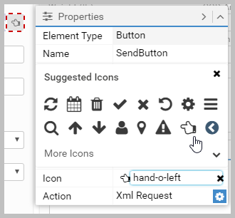
Designer supports font-awesome shortcuts for icons, for
example, fa-user. If a control has an Icon property, you can
type the shortcut (without the fa- prefix), or select the icon from the suggestions.

Tip - Icon only labels
Label controls have the Icon property, and as text in a label is optional, this means that you can add icons as
Label objects instead of Image object.
If you want to change the color of icons, use CSS. For example, if you have a Label control
called GoldUser that has its icon set to fa-user, adding
the following CSS would make the icon gold:
#widget-designer #GoldUser .fa-user { color: #FFD700; }
See CSS in Apps for general information on the role of CSS in Apps.
Article last edited 19 August 2021