Font, color, formatting and positioning
The toolbar includes:
- X, Y, Width and Height. Use these for item alignment, and to make controls the same size. X and Y define the top left. Nudge items one pixel at a time using the keyboard’s arrow keys (Ctrl arrow does 20 pixels). You can also resize using the mouse.
- Background Color and Border Color controls.
- A typical set of font controls.
- Alignment controls. These are text alignment, not item alignment.
Color
On the toolbar, Background Color and Border Color give you a typical color picker control including transparency.

Borders are within the bounds of the object. For example, in a Container, the border occupies pixels within its Width and Height. When setting a border, you need to set both the number of pixels and its style. Style defaults to None meaning no border regardless of any pixel setting.
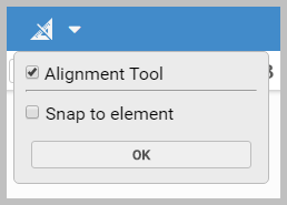
Rulers and the Alignment Tool
On the toolbar, you can toggle rulers on and off. The same button also includes Alignment Tool. When selected, you get alignment bars to help you position items. This can include 'snap to', if required.
Send Backwards/Bring Forward
Items on a page can be layered. Use the toolbar’s Send Backwards  and
Bring Forwards
and
Bring Forwards  commands to manage this. Overlapping hidden items can be differentiated on the canvas by their contrasting striped shading and selection border. Hidden
items are mouse selectable. However, you can also use Page Navigator.
commands to manage this. Overlapping hidden items can be differentiated on the canvas by their contrasting striped shading and selection border. Hidden
items are mouse selectable. However, you can also use Page Navigator.